

New identity
2021
Art direction & brand identity
Kawakami Ediciones
The project
Kawakami Ediciones is an independent Argentine publisher with a soft spot for forgotten novels: works that never got their moment, and the lesser-known books of well-known authors. It wants to share its discoveries and add variety to Argentine literature.
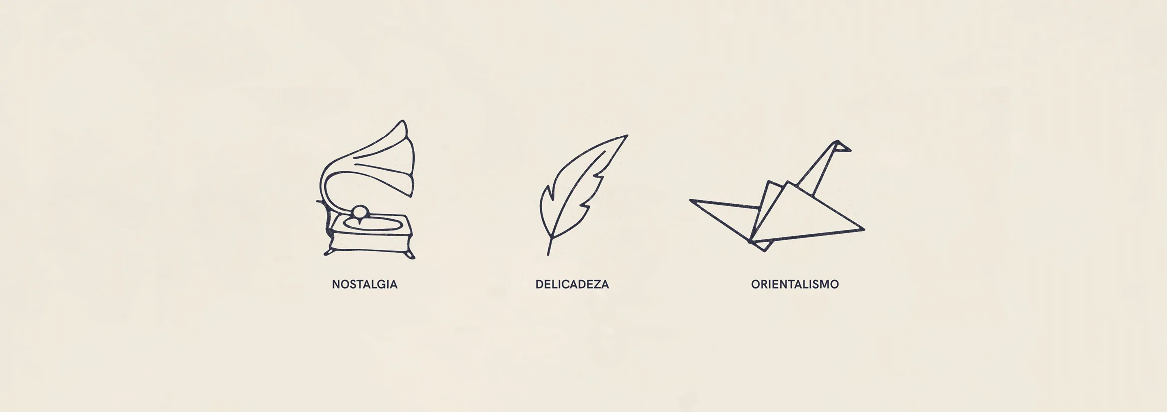
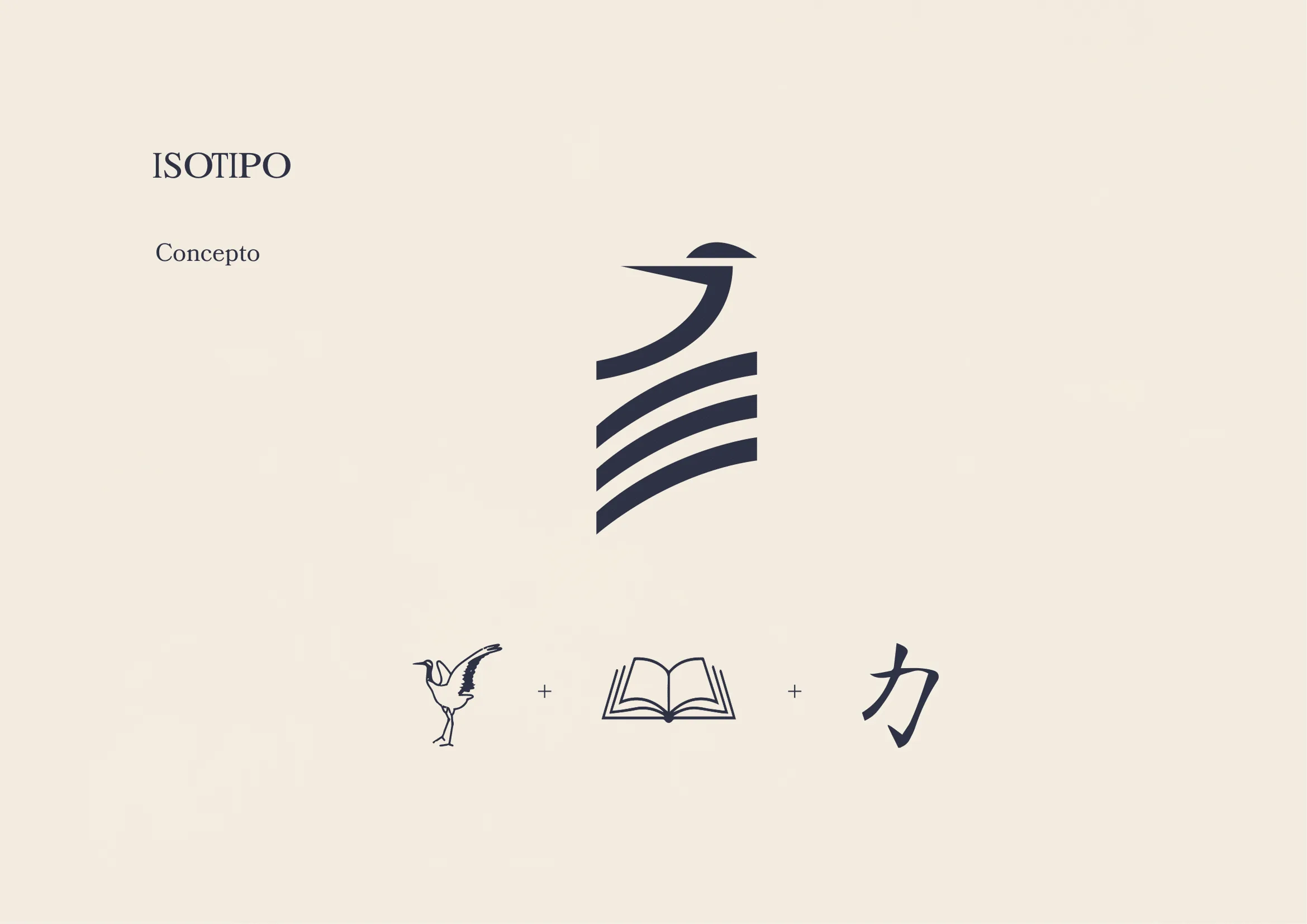
The brief: a brand warmer and closer than the rest. In its own words, the feeling of finding something precious at your grandmother’s house. Courage, originality, memory, subtlety and generosity, folded into one mark: a crane, an open book and the Japanese ka.